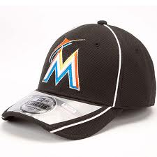
 The new Miami Marlins logo is a fantastic look for somebody pulling down $8 an hour at a burger joint or a juice shop. But on a professional athlete making a couple of million dollar a year for hitting .236? I don’t think so.
Detached from baseball, the logo is appealing. The font is light, modern, inventive. The marlin swoosh is clever. The color palette seems drawn from the shells washing up along the Atlantic beaches (or maybe from Robin Williams’ wardrobe in “The Birdcage.”)
But apply the logo to a cap as shown and we’re talking Orange Julius in Ocala, not Game 7 of the Fall Classic.
I suspect that the Marlins players will react to these uniforms much the way male dogs that get frou-frou haircuts do: They’ll skulk for a few days, then gradually build up the nerve to venture out in public.
Once the Marlins’ new uniforms get a few grass stains and cleat tears, they’ll look better. And I will give them this much credit: They make me appreciate the old Houston Astros’ mustard-stripe specials.
The Miami Metrosexuals (oops…Marlins) new logo is the bomb!
It’s growing on me, and the community too. And if nothing else, the Marlins of all teams are leading off season news.
Orange Julius in Ocala. I love it! Damn, that’s a corny looking hat.
Bill
I think the cap gives the Astros fruit-loops look a run for its money. It will be interesting how they spin it to try to get fans to buy multiple caps. I wish they would have kept it to just three colors: white, orange and turquoise.
Dan, I’ve been enjoying getting acquainted with your blog. I write one on graphic design, but as my co-author and I are both big baseball fans, we find ourselves writing about baseball a lot. Here’s my take on the Marlins logo:
http://www.interpretationbydesign.com/?p=6319